Product design · Full stack · Founder
Shiftsly
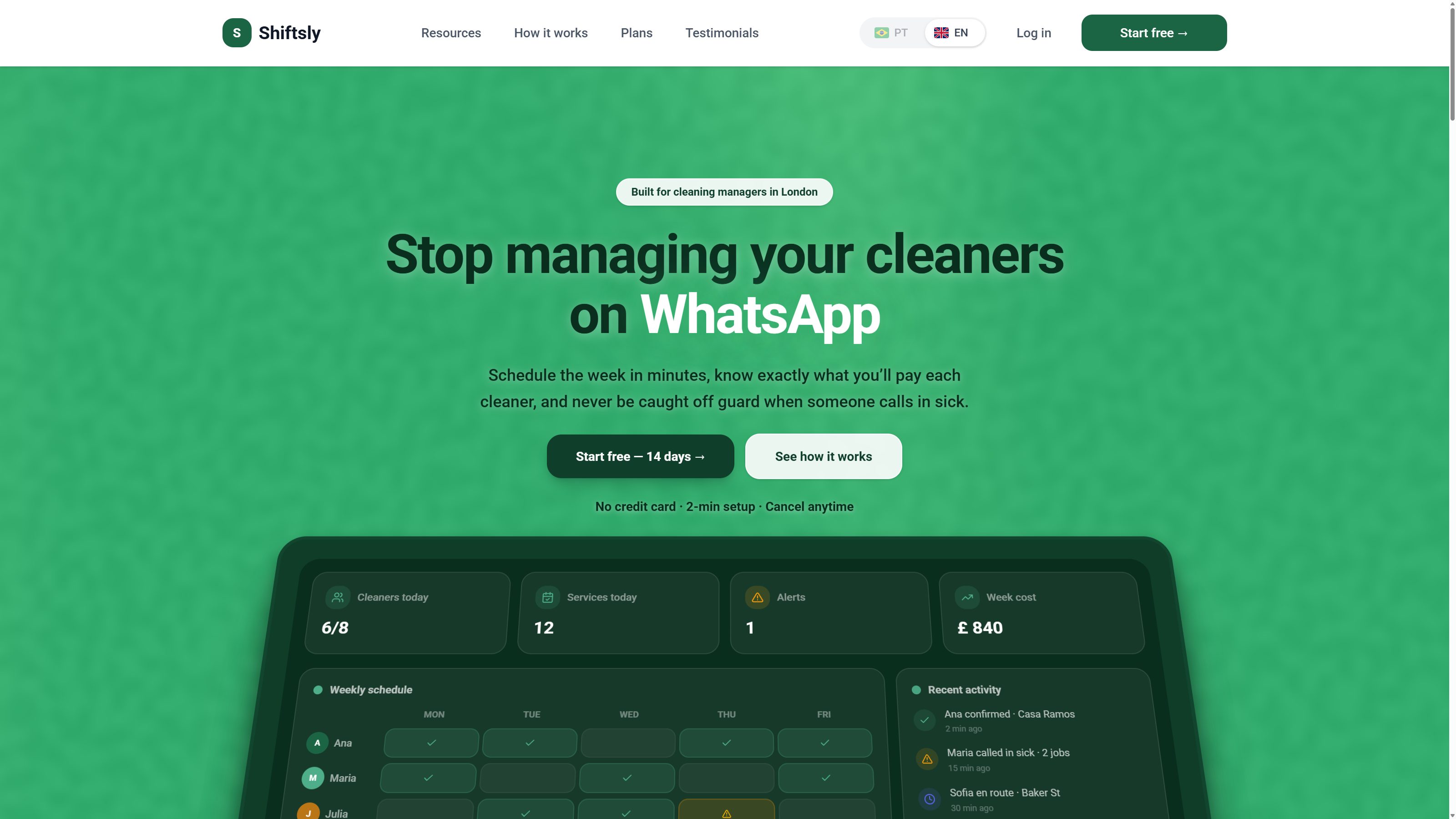
A scheduling tool for small UK cleaning teams. I found the problem talking to cleaning team managers, then designed and built the whole thing myself.
- Year
- 2026
- Role
- Founder, designer and engineer: research, UX, UI, frontend, backend, auth, billing
- Stack
- Next.js, TypeScript, Prisma, PostgreSQL, NextAuth, Stripe, Resend
- Live at
- shiftsly.com
The problem
An operation running on chat scrollback
I kept meeting the same situation in UK cleaning teams. Managers ran everything through WhatsApp threads. Who works Tuesday, who covers a sick day, which client site, what each person gets paid, all of it buried in chat history.
It stops working past a handful of people, none of it is structured data, and nobody can see who is covering what. The tools that exist, ZenMaid and Jobber among them, either miss the cleaning specifics or serve operations far larger than the five-to-twenty person crews that make up most of the market.
One constraint decided the rest: the buyer checks this standing in a client's driveway between jobs, on a phone, with one hand. Not at a desk.
Scope
What I owned
No co-founder and no team. Every decision below was mine to make and mine to build.
Design decisions
Designing for a driveway
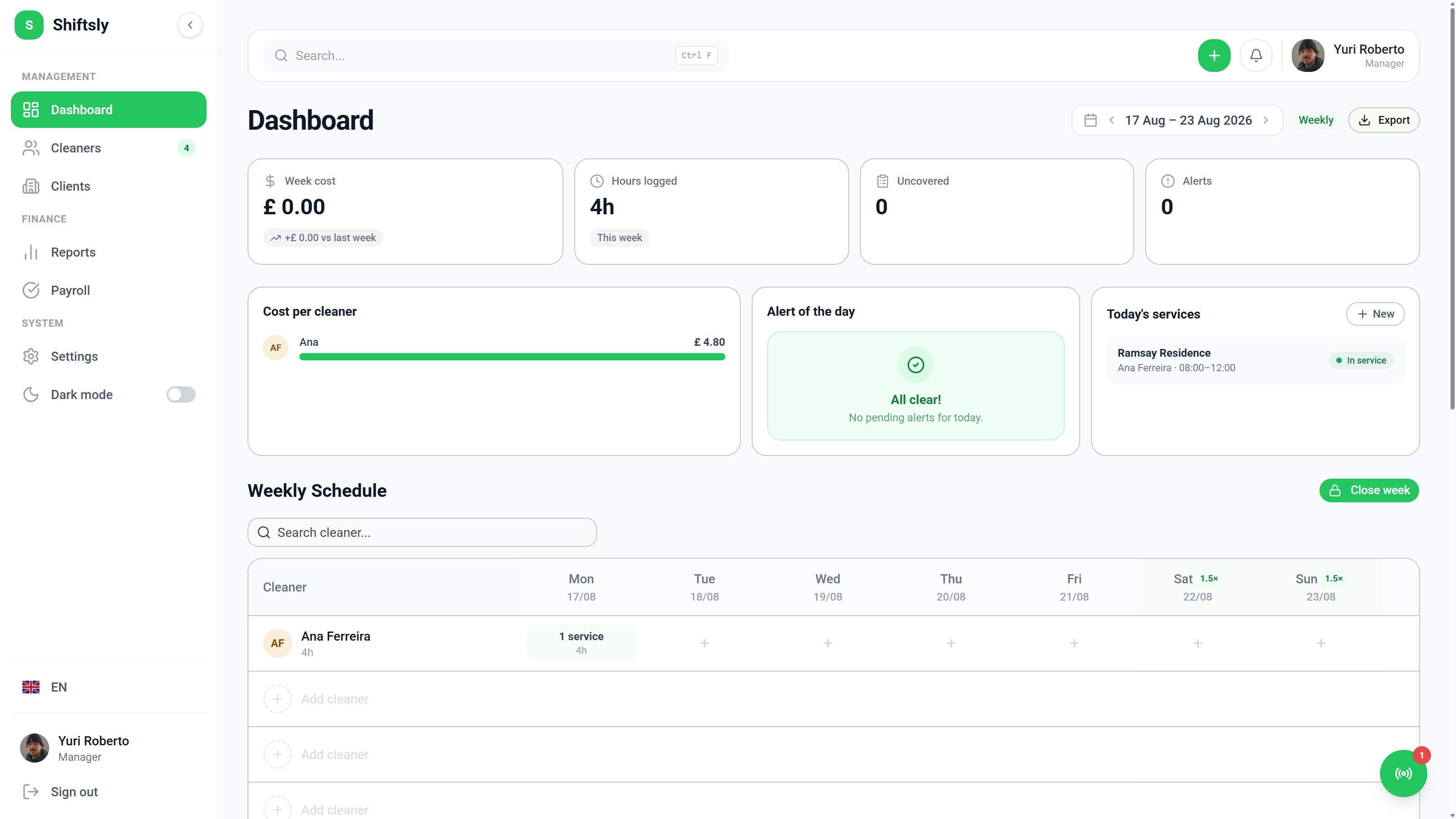
The schedule is a carousel, not a grid
Every scheduling tool draws a weekly grid with days across and people down. On a phone held in one hand it fails, because you either pinch to zoom or scroll in two directions at once.
I built the core view as a swipeable weekly carousel instead. One day at full width, reachable by thumb, with the week sitting above it as context. The structure underneath matches how a manager thinks, moving from teams to employees to weekly shifts to status, rather than borrowing a calendar app's data model.
The cost: you lose the whole-week glance a grid gives you free. I accepted that because the frequent question is who is covering today and whether anyone is missing, and I kept a wider layout for the desk sessions where the other question comes up.
No passwords anywhere
Sign-in runs on Google OAuth or a magic link. The product has no password field.
For a non-technical buyer signing up on a phone between jobs, every field is somewhere to give up, and every password becomes a support ticket I answer myself. Removing the field removes both.
The cost: magic links make email deliverability a hard dependency. I judged that smaller than the drop-off and the support load of password auth.
Priced in cleaners, not seats
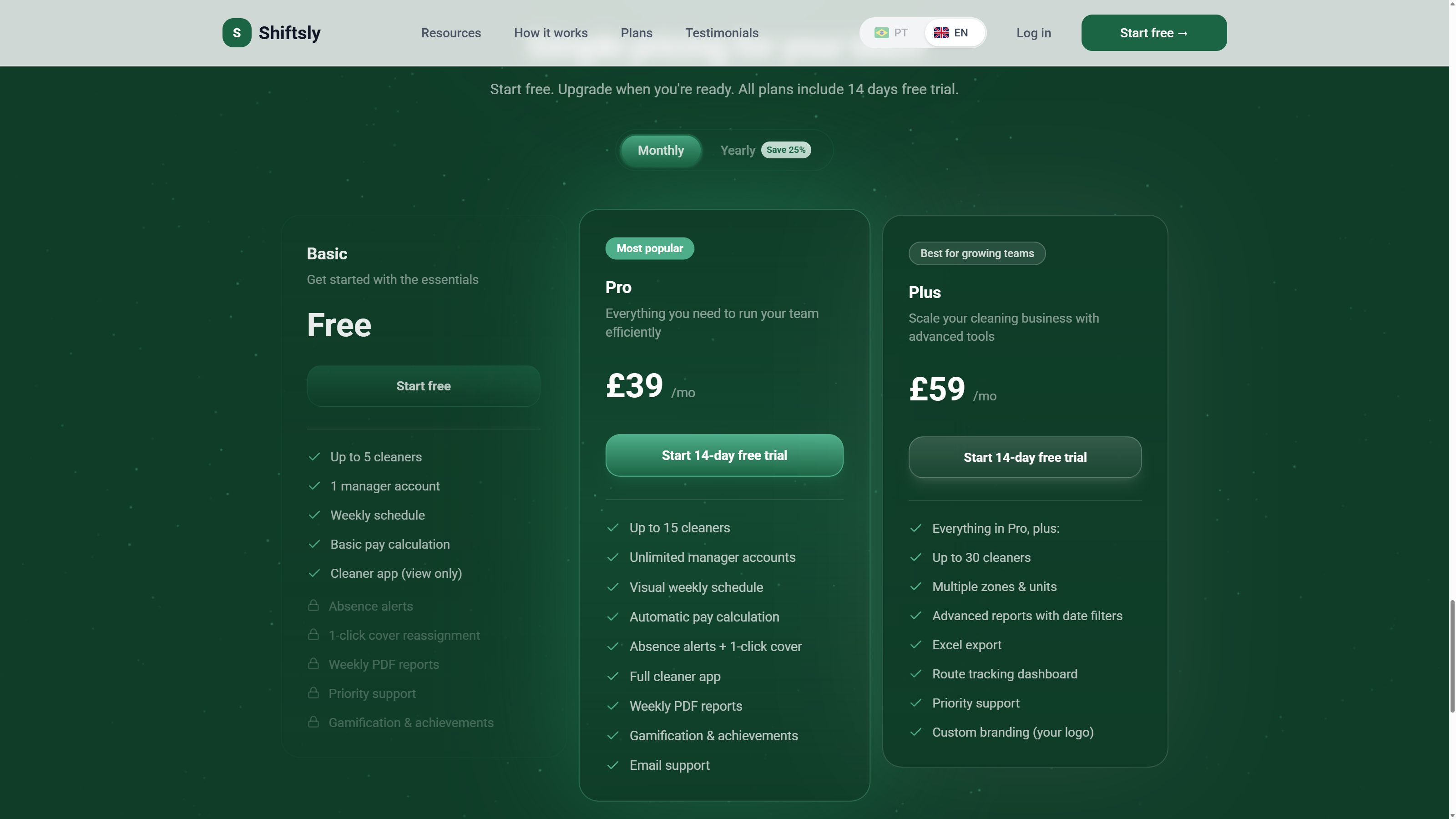
Three tiers, each labelled by headcount. A cleaning team manager thinks about how many people they have, never about how many licences they need, so the pricing page speaks in cleaners.
The free tier runs up to five cleaners and works as a real product rather than a crippled demo. That forced the interface to hold up at zero revenue, and it made the upgrade prompt feel earned.
Feedback
Closing the loop with real users
Rather than guess at friction, I built a usability test into the product: a short multi-step form with NPS scoring that I review through an internal admin panel. Real users mark real friction, and that decides what I redesign next.
I did the same for the business side. Instead of opening dashboards by hand, I built an agent that pulls live signals from Stripe and the database twice a day and sends me a digest. It is growth instrumentation with an audience of one, running the same signal-to-action loop a growth team would.
Takeaway
What this project shows
I find problems before anyone assigns them. Nobody briefed Shiftsly. It came from noticing the same broken workflow repeatedly and then checking whether existing tools served that segment. That work happens before any screen exists.
I make trade-offs and can defend them. The carousel gave up the week glance. Passwordless auth took on a deliverability risk. A real free tier gave away real value. I would make all three again and can tell you why.
I own commercial surfaces. Pricing model, checkout and subscription lifecycle, live on Stripe rather than sketched.
Auth, billing, the scheduling core and the growth agent were built in close pair programming with Claude Code, from schema through interface.
← All work